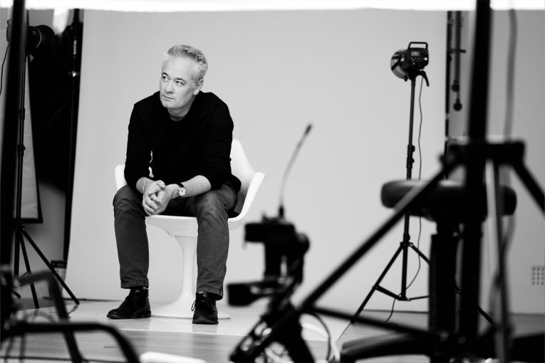
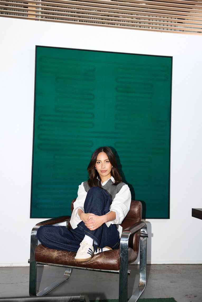
The South Australian designers to watch
South Australia houses a wealth of renowned designers. Here, we chat to some of the creatives who make this state so rich with innovation.
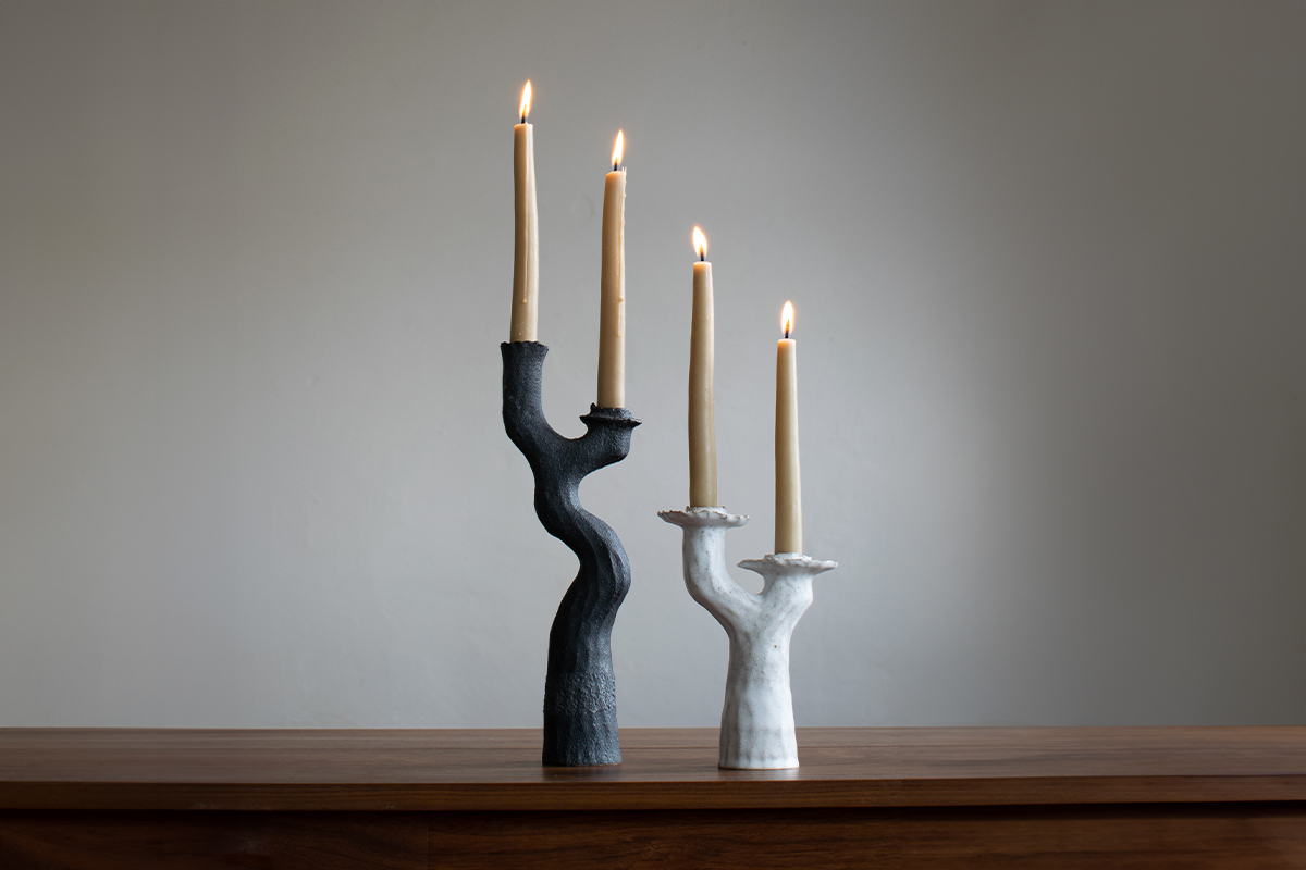
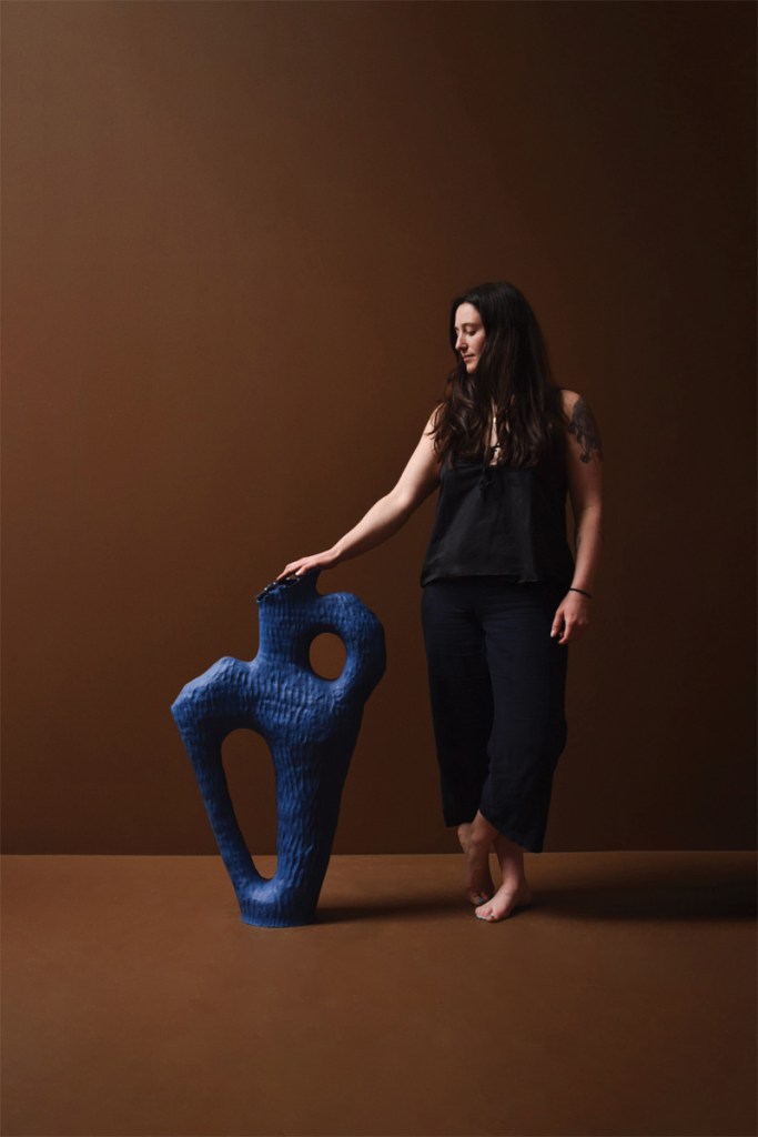
Kerryn Levy
Ceramics
Ceramicist Kerry Levy uses the traditional hand-building processes of pinching, coiling and slabbing for her pieces, which are inspired by the landscape and the human interaction within it.
Where do you find inspiration for your work?
I’m deeply inspired by the natural world — by the flowing silhouettes of flora, fauna, and human movement. Often, I start a new piece by sketching shapes and forms derived from photographs of botanical or anatomical subjects. My colour palette evokes the Australian landscape — warm terracottas, charcoal blacks, silky whites — but I’ve recently begun to experiment with metallic finishes and brighter hues to bring a fresh vibrancy to my work.
What is the most-used item in your studio?
Without a doubt, the most indispensable tools are my own hands. Each coil is shaped, attached, and smoothed by hand. Outside of that, my kilns are essential, as every piece must be fired — usually twice, sometimes more, to achieve its final form. My banding wheel is also used to help me build every piece: it’s the rotating platform where I build and refine each piece from the bottom up.
To you, what are the markers of good design?
My work sits at the intersection of fine art, design, and craft, spanning sculptural and functional pieces, from vases and candle holders to more conceptual forms. Good design, to me, balances impeccable craftsmanship, practical functionality (when relevant), and a harmonious aesthetic. Each piece should feel intentionally made, thoughtfully refined, and evocative.
What colours or materials are inspiring you right now?
Lately, I’ve been exploring silver and platinum lustres. Applied atop a glaze, they accentuate the tactile texture beneath, gently catching the light and bringing out the subtleties of each fingertip mark and layered surface.
How would you describe your aesthetic?
Organic, textured, layered, and patterned — my pieces reveal the maker’s hand. The surface tells a story: finger marks, coil lines, and glazes speak to a process that’s intuitive, tactile and human.
What is your design philosophy?
I want anyone experiencing my work to feel a spark of connection — person to object, object to place, place to memory, memory back to people.
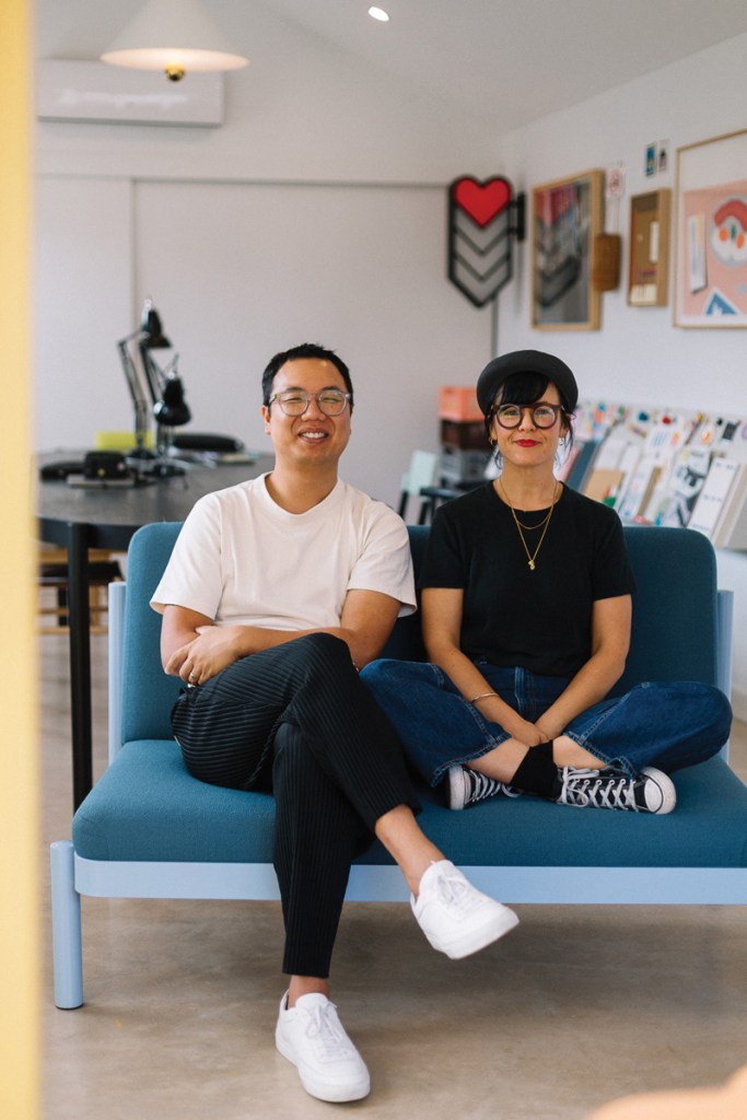
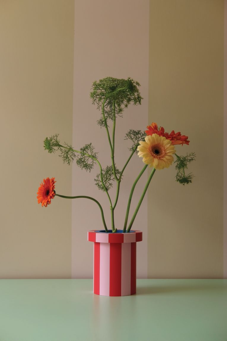
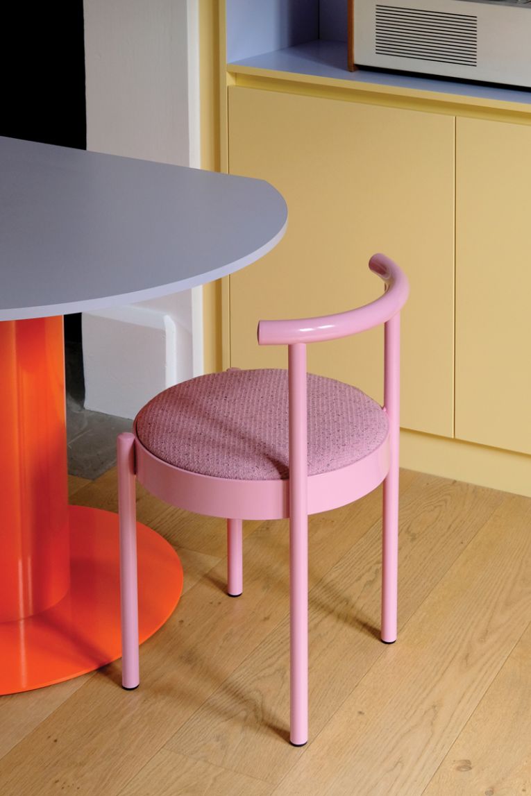
Daniel To and Emma Aiston
Homewares + furniture
Daniel To and Emma Aiston established design studio, Daniel Emma, in 2008. The simple forms they create range from desk objects to installations.
Where do you find inspiration for your work?
We find inspiration in everyday things — stationery, shop signage, hardware stores, fruit. It’s often the ordinary or overlooked that spark ideas. We’re drawn to simple forms and colours that have a certain charm or awkwardness.
What is the most-used item in your design studio?
Probably the tape measure. We’re always measuring, testing proportions, checking scale. That and the kettle.
To you, what are the markers of good design?
Good design has clarity. It does what it’s meant to without trying too hard. It should feel resolved, even if it looks a bit strange. There’s a quiet confidence in good design.
What colours, materials or shapes are inspiring you right now?
We’re still drawn to primary colours, but softened a bit — dusty blues, mustard, dirty pink. In terms of materials, painted metal and timber always feature. Shapes are usually simple – circles, rectangles — but arranged in ways that feel unexpected.
How would you describe your aesthetic?
Playful but precise. Honest. Sometimes a bit naïve-looking, but everything is considered. We try to balance function and personality without adding anything unnecessary.
What is your design philosophy?
We want our objects to make people smile, but also last. We care about proportion, materiality, and restraint — we’re not into decoration for decoration’s sake. Everything should earn its place.
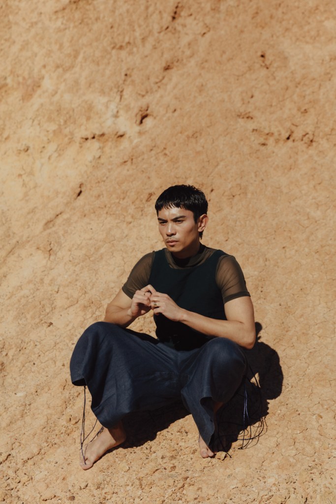
Zach Lopez
Costume
Zach Lopez is multi-talented as an Australian Dance Theatre Company artist and costume designer of the company’s show, Two Blood.
Where do you find inspiration for your work?
Inspiration for my creative and performance practice usually oscillates between the experiential, myth and archive. I draw from my Filipino heritage and combine personal experiences with socio-political history, sci-fi and folklore. I’m really interested in reimagining the experience of the ‘other’, with a focus on dual identities.
I like to bring cultures and ideas together. To see how two things from unlikely places can create strange and exciting intersections on the body.
What is the most-used item in your design studio?
A notebook. In the development of a work, I’m always noting things down, drawing pictures, collecting images to make moodboards … there’s something about keeping everything physical and tactile that’s incredibly helpful to my process. Scribbles are very important. Always.
To you, what are the markers of good design?
I always think about the moment when you put on a costume as a performer. It is such a special moment. A lot of the rehearsal and preparation that you’ve done crystalises in that moment because it wraps up everything you’ve been thinking about and processing and making. I think of the best costumes or design that I’ve interacted with as a performer and it’s always been something that’s solidified the ideas at the core of the work.
I think design needs to speak to ideas without restricting the choreography. Restriction can, of course, be purposeful. But a good costume shouldn’t get in the way of the choreography. It should complement it. It should help the dancer embody or convey what they need for the audience.
When I think about costume, I think about how it can exude multiple meanings through concept and function. How, as the dancer and the body moves, a costume can work to create new shapes, distort the body, or aid in the movement.
What colours, materials or shapes are inspiring you right now?
The colour indigo is inspiring costumes I’m currently conceptualising for Two Blood.
The work centres around the bodies of two lovers who were found in a forever embrace in Queensland. One of them was a Tagalaka woman, one of them was a Chinese man. The work, which is being made by Wiardjuri artistic director Daniel Riley, Tagalaka choreographer Jasmin Sheppard and writer S. Shakthidhan, tracks and seeks to unearth the connections between Chinese migrants and First Nations people during the gold rush. And, in doing that, kind of rewrites parts of our national identity in the process.
Indigo started as a rare commodity — it was associated with richness. Royalty. But then, throughout the 18th century, it became a colour associated with working people. Labourers. I’ve been thinking a lot about workwear. How design can be at once entirely utilitarian and beautiful. About what happens when you smash these ideas together — utilitarian shapes with rich or once royal colours like indigo.
What is your design philosophy?
I want my designs to be deeply rooted in culture and to bring conversations around cultural context to the forefront of the work. When someone walks out of Two Blood I want them to be thinking about belonging and what that means culturally. How Chinese and First Nations people are connected and have been on this country for a very long time. I want my costumes to speak to that sense of enduring kinship.
And … I guess that I don’t necessarily think form and function need to be over or under each other. Form and function need to be talking to each other at all times.
Jim Hannon-Tan
Industrial
Jim Hannon-Tan is a designer working across industrial/product, brand and packaging — ranging from medical devices to luxury objects. Years in Milan, Amsterdam and London shaped his approach: strategic, human-centred, and craft-forward.
Where do you find inspiration?
Nature, material behaviour and cross-pollination — where one project informs another. A personal exploration into compliant mechanisms might inform a medical device; a review with an electronics engineer can spark a new phygital object.
Most-used item in your studio?
Plain A4 printer paper. I sketch, map systems, hold drawings up on video calls, then photograph and timestamp the day’s stack for reference — an archiving habit I admired in Alessandro Mendini’s studio.
Markers of good design?
The intersection of business, technology and culture. Holistic systems thinking, clear problem framing, curiosity that questions assumptions, and restraint in execution. It should ease engineering where appropriate — and challenge it to unlock something better.
Colours or materials inspiring you right now
Conductive metals (brass, argentium silver), graphite blacks, 3D-printed resins, and reclaimed hardwoods with honest grain. I’m drawn to finishes that age well and show use.
How would you describe your aesthetic?
Quiet, purposeful, material-led. Simple forms carrying a precise idea rather than decoration. Decorative elements are also technical — technical elements are expressed aesthetically.
Design philosophy
Distil complex ideas into clear, human expressions. I value the Italian tradition where wit and warmth sit alongside rigour — often missing in more purely technical approaches. Design, at its best, advocates for the human experience.
Arty Kovacs
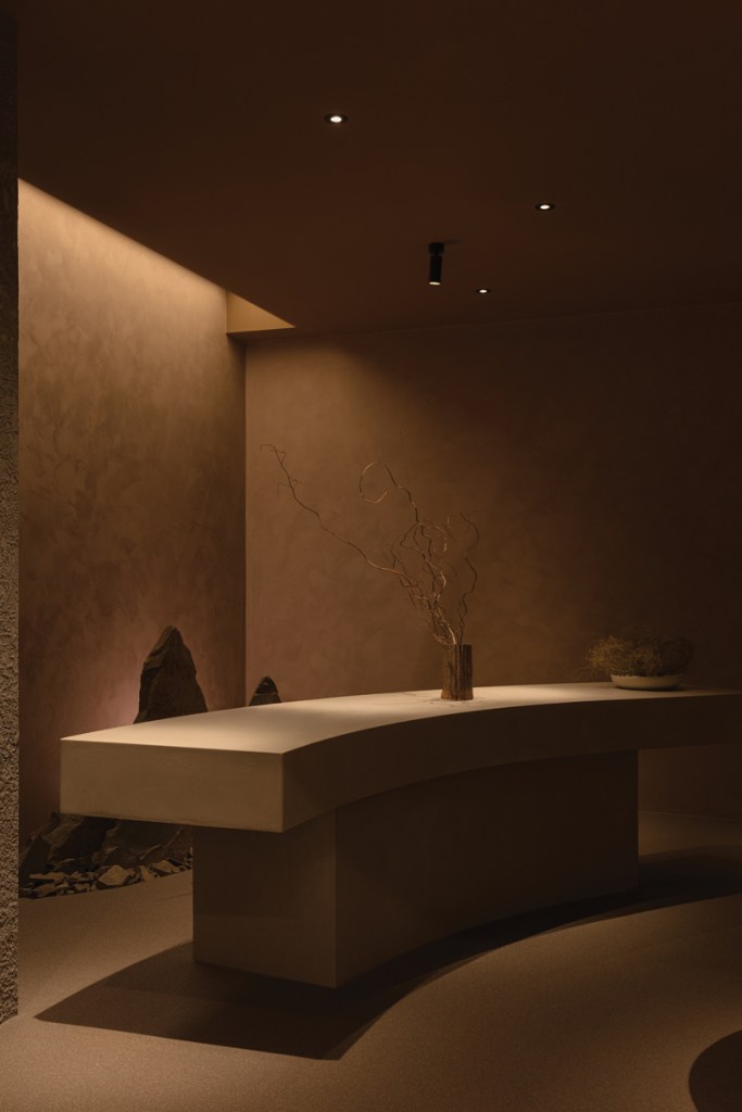
Interiors
A. Fitzgerald Design is a boutique interior architecture and design firm, of which Arty Kovacs is director.
Where do you find inspiration for your work?
I’m inspired by architecture, natural materials, and above all how a space can shape behaviour and mood. I often encourage clients to think of their favourite restaurant — how it makes them feel, and then imagine their home evoking the same sense of atmosphere.
What is the most-used item in your design studio?
Trace paper. It’s where I can test ideas, layer possibilities, and quickly explore how spaces might flow.
To you, what are the markers of good design?
Good design makes you feel something. While form and function are important — it’s the psychology of space, creating environments that support wellbeing and connection.
What colours or materials are inspiring you right now?
I’m really enjoying the tension between bright, energetic tones — almost like highlighter yellow or fluro blue paired with grounding, deeper hues such as deep navy or burgundy. The contrast creates both vibrancy and balance.
How would you describe your aesthetic?
Refined, layered and intuitive. My approach is less about trends and more about curating materials, textures and colours that feel reliable to both the client and the space.
What is your design philosophy?
I design through the lens of spatial psychology — creating spaces that not only look considered, but also shift how people feel, live and connect within them.
Jana Carlton
Fashion
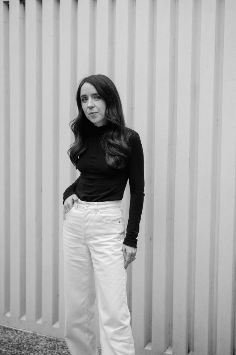
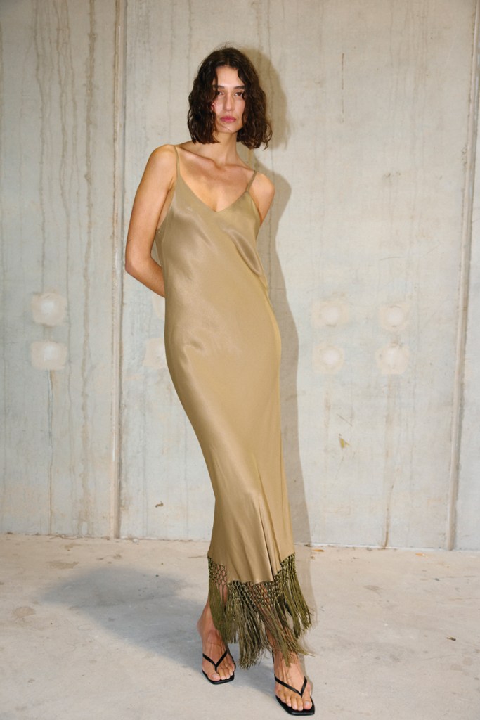
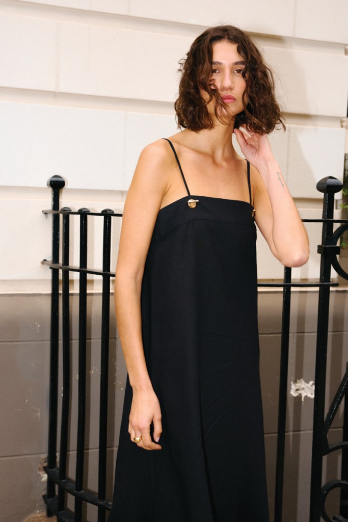
Director of fashion brand Kinney, Jana Carlton places a focus on sustainable practices and designs for women of all shapes.
Where do you find inspiration for your work?
Sourcing initial inspiration from fabrics and prints has a considerable impact on how I approach designing a collection. Often, I will only start designing into silhouettes once I have found or developed the perfect print or two, then I will start building a colour palette and collection from there. For our latest Resort 26 collection, we worked closely with a textile designer and were inspired by flower motifs that originate from the 1600s to 1700s. These were reworked to be uniquely ours in a striking placement print for our November drop. Once we developed our focal point around this artwork, the rest came organically and included soft pin stripes, textured linens and a soft colour palette that complemented the striking print.
What is the most-used item in your design studio?
I cringe to say my laptop first comes to mind; I do so much digitally. Second would be our central workshop table. It is always covered in fabric cards, sketches of new designs that we are mapping out, samples getting measured and approved.
To you, what are the markers of good design?
Wearability, longevity, quality, timelessness, and subtle/clever design details. I am always so thrilled when I get feedback from customers that they are still wearing their pieces they purchased years ago and have worn to death, yet they still look just as new and relevant all these years later. It just shows that buying good design and quality over cheap fast fashion is often worth the investment.
What colours or materials are inspiring you right now?
Right now, I am particularly inspired by a specialised Japanese technical fabric that we have worked into our Australian made capsule ‘Essentials’, launching in October. It is a brilliant quality that behaves and wears like silk, but is so much easier to care for as it is machine washable, breathes on the body and doesn’t need ironing or dry cleaning. It is the perfect travel fabric as you can roll it up tightly in your suitcase when travelling and pull it out and pop straight on.
How would you describe your aesthetic?
Kinney’s aesthetic is timeless and versatile silhouettes that transcend seasonal fashion trends and are designed for everyday wear that can be mixed and matched to create a variety of looks.
What is your design philosophy?
My design philosophy for Kinney is catered around creating pieces that are versatile, hold a point of difference, are wearable and timeless. My focus is on creating pieces that are designed and made to last and can be worn for many years to come.
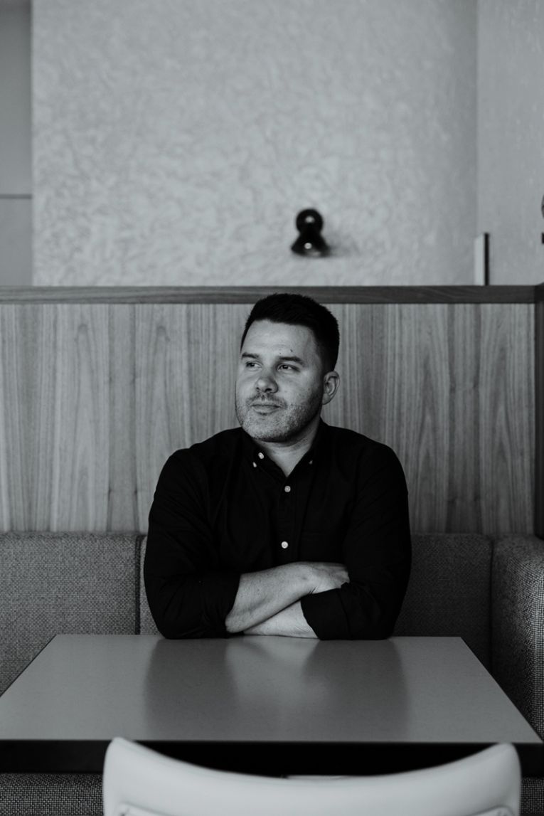
Ryan Genesin
Interiors
Ryan Genesin is the director at Genesin Studio, working on hospitality, residential, retail and commercial projects.
Where do you find inspiration for your work?
Inspiration for me comes through many ways, from nature and natural form, music, travels and art. Sometimes in the studio we play with materials and get inspired by the trade or fabricators tooling that creates detailing.
What is the most-used item in your design studio?
The coffee percolator and the Sonos sound system … we always have music and coffee!
To you, what are the markers of good design?
Good design is about creating an innovative solution. This doesn’t need to be radical and avant-garde, but it means different things when designing in different spheres of residential, hospitality and retail projects.
In residential projects, good design is about making your life easier, hiding clutter and utilitarian needs, creating a sense of calm and recharge, living and laughing, but to harness positive attributes of the site or bones of the building like views, materials and light.
In the commercial sphere with retail and hospitality projects, good design is about springboarding brand, market awareness, growth and return customers.
What colours or materials are inspiring you right now?
We have been working on lots of earthy palette projects at the moment and loving dusty autumn tones. When it comes to material inspiration, we love working with local suppliers and quarries to create new bespoke project specific materials, sometimes finished differently to enhance colour or texture, but sometimes simply inspired through the makers own processes and tooling. In the past we have worked with metalsmiths, ceramicists, furniture makers, rug makers, artists, and stone masons to name a few. We find it very empowering knowing their workshop potential.
How would you describe your aesthetic?
Some aesthetic undertones would be the use of light and texture. I love how material feels and the joining detail of the material that adds a nuance to the project. Moving through space with scale, height and acoustic change is also notable in my projects where hierarchy change creates pinch point and thresholds. My use of these aesthetic changes over project realms but I like to keep the palette calm and minimal; residential I like to be more timeless while celebrating the bones of the building or creating a new design language.
What is your design philosophy?
My philosophy varies over different project typologies; residential I like to be more timeless, curated, minimal yet warm, harnessing modernist ways about living and entertaining, celebrating the water rituals of the day. With retail and hospitality spaces, these are more fun, innovative, experimental and immersive to capture an audience, we want you coming back for more!
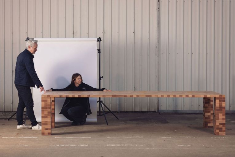
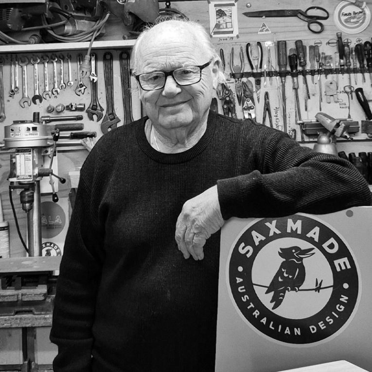
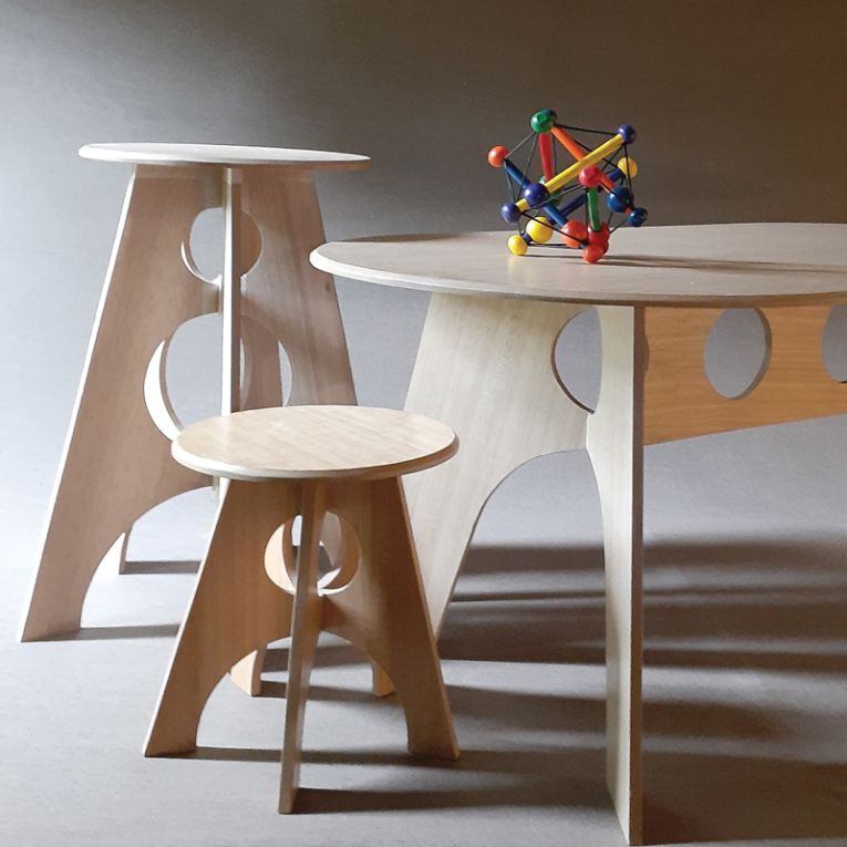
Saxon Rudduck
Furniture
Architect and furniture designer Saxon Rudduck is the brains behind Saxmade.
What is the most-used item in your design studio?
HB clutch pencil, A4 paper and a soft rubber.
To you, what are the markers of good design?
Something that is designed well has an honesty and resolution of the project’s issues. It will exhibit a simplicity and an integrity that is convincing in itself and does not immediately ask you to think of a better alternative.
What colours, materials or shapes are inspiring you right now?
I am inspired by the facets, shadow and shade of geometric forms and working with clear finished natural colour Tasmanian oak composite board. I am continuing development of furniture, in a “geometric/functional” style.
How would you describe your aesthetic?
An admiration of the simplicity, clarity and strength of the early 20C modernists (eg Bauhaus) and the strength of character that they brought to bear on their designs.
An admiration of resolved, complex, industrial products — the ultimate, to me, being aircraft. These are so complex and have so resolved the “trade-offs” (design choices) it is a wonder to me how they all end up looking so beautiful.
The pleasure of non-digital design, drawing and making and the deep attraction people have to this.
What is your design philosophy?
I aim to produce work that has regard for human beings and makes their life better. I am a strong believer in “form follows function” — something should look like what it is and not appropriate the look of other objects. The “function” aspect of this includes the emotional needs of the users.
“Less is More” — a design will improve as it is developed and as it gets closer to the ideal it becomes simpler and better.
“Firmness, Commodity and Delight” — an ancient classical concept of architecture. A building, or object, should be strong, functional and have emotional appeal.
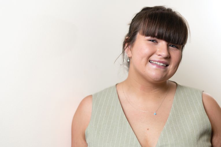
The Emerging Designer
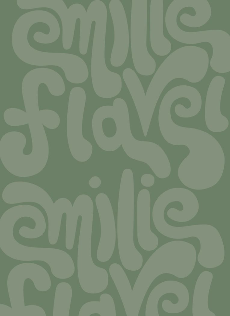
Emilie Flavel
Graphic design
A recent graduate of TAFE SA’s graphic design program, Emilie Flavel, won the gold medal for graphic design at the WorldSkills National Championships 2025.
Where do you find inspiration?
I find that inspiration can come from anywhere — I try to keep my eyes open to the world around me. Sometimes it’s the bold typography on a billboard, a clever layout in a random magazine, or even the unexpected colour combinations on a flyer I come across in passing. I find that everyday visuals, no matter how ordinary they may seem at first glance, often spark creative ideas. I believe inspiration is everywhere — it’s just about being curious and receptive enough to notice it.
Most-used item in your design studio?
Honestly, I’d have to say pen and paper. I really enjoy the early stages of the design process — there’s something about sketching out rough ideas that helps me think more freely and creatively. It’s where everything starts, and I love being able to see the initial spark evolve into the final piece. Sometimes the final design ends up looking totally different from the first sketch, and other times it just goes through small tweaks and refinements. Either way, there’s something really satisfying about looking back and seeing how far the idea has come.
What are the markers of good design?
For me, good design starts with simplicity. It should clearly tell a story and connect with its intended audience. Before I even begin designing, there’s a lot of research involved — understanding the market, the brand, and the people behind it. Knowing what the target audience is looking for, as well as understanding the vision of the client or business owner, it really helps shape the creative direction. Good design isn’t just about making something look nice — it’s about creating something that communicates, resonates, and serves a purpose.
What colours or materials are inspiring you right now?
Lately, I’ve been really drawn to using watercolours in my designs. I love the soft, organic feel they bring, especially when combined with other materials. Mixed media in general really inspires me — it adds texture, energy, and a kind of playful, vibrant quality that I enjoy exploring. In terms of colour, I’ve been leaning into more natural tones — like soft greens, muted pinks, and creamy neutrals. They feel calming, fresh, and in a way, really reflective of who I am and the kind of mood I want my work to give off.
How would you describe your design aesthetic?
I’d say my design aesthetic is versatile. It can range from bold and colourful to clean and corporate, depending on the project and the client’s vision. I really focus on what the brand needs to communicate and how it wants to be perceived. Whether it’s playful and vibrant or minimal and professional, I adapt my style to create something that feels authentic and effective for the audience.
This article first appeared in the October 2025 issue of SALIFE magazine.
Want to see more stories from InDaily SA in your Google search results?
- Click here to set InDaily SA as a preferred source.
- Tick the box next to "InDaily SA". That's it.